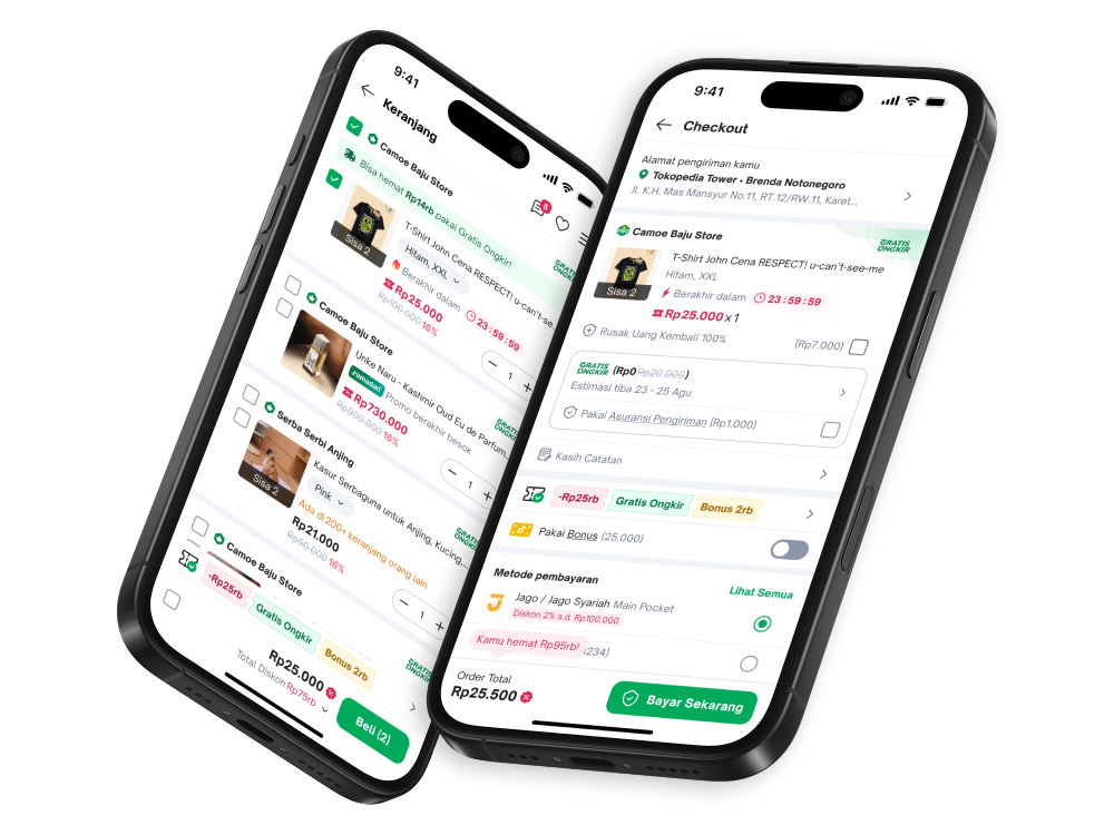

Tokopedia
Product Designer
2024 — 2025
Tokopedia: seamless purchase flow
Closing the promo gap between PDP and cart — so price, savings, and urgency stay visible through checkout
Overview
Promos looked great on the homepage and PDP. Open the cart, and most of that value was gone.
Since H2 ’24 I’ve owned Tokopedia’s purchase experience end to end: cart, checkout, and order management. Four designers used to cover that module. Under me it became one journey — coupons, logistics, and payment reading as connected screens instead of separate handoffs.
The 2025 buyer vision pushed promo affordability hard: final price after vouchers, visible savings, honest math. Urgency and social proof had to sit at the decision point too, or buyers wandered. Cart and checkout had to carry those signals themselves.
We shipped the redesign for Ramadan 2025 (Q2 ’25). Other buyer surfaces later borrowed the promo color treatment.
The problem
Research — qualitative and quantitative — pointed at the same break.
Buyers said cart and checkout were usable, but not enough to finish now. Tokopedia wasn’t showing real promotions at the moment of decision.
Price also jumped between cart and checkout once shipping, insurance, and add-ons appeared. Promotions from home and PDP often vanished once items hit the cart — right when people were ready to pay.
We benchmarked how Tokopedia, TikTok Shop, Shopee, and Agoda present promotions, price structure, and information density, then annotated Tokopedia’s existing cart for what actually earned attention.
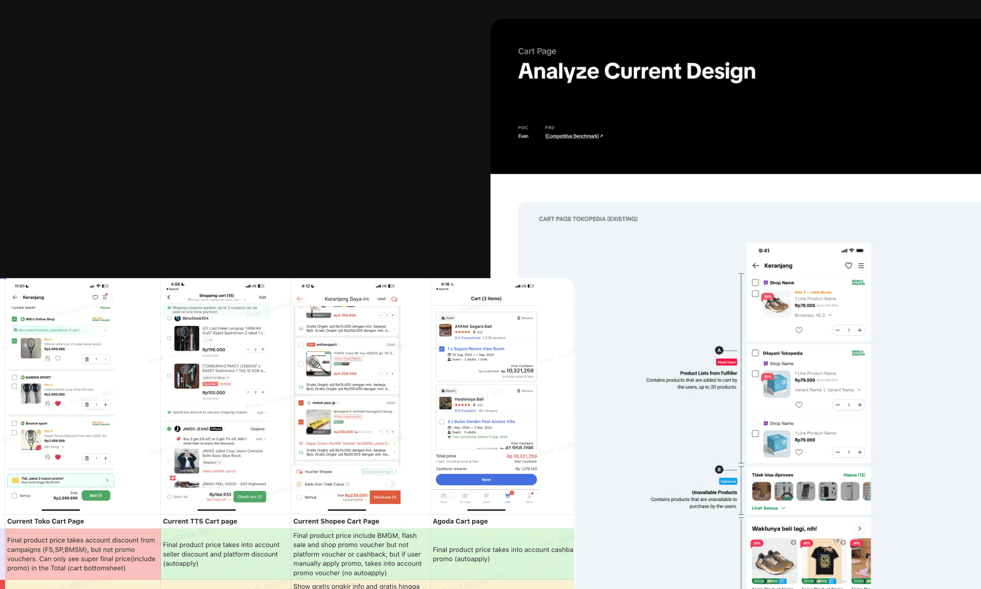
Three gaps owned the brief:
- Price transparency — Unit price reflected campaign discounts but not promo vouchers. The true final price hid in the cart-total bottomsheet. TikTok Shop and Agoda folded more of the discount into the unit price. Buyers needed the math itemized before checkout.
- Product-list density — Above the fold, the cart held about three products. Vertical space went to low-value chrome. The row needed essentials only: image, name, price, variant, promo.
- Decision confidence — Little in the flow pushed commitment at the CTA. We needed clearer savings, scarcity, social proof, and progress cues where buyers actually pay.
Going forward we needed promo and price continuity back, and a tighter UI so the interface itself helped buyers decide faster.
Direction
Three pillars. Each had to ship in the UI, not only in the deck.
Affordability, made visible. One visual system for promotions across cart and checkout: campaigns, flash sales, price drops, vouchers, upcoming value — same language, next to the price.
Urgency and social proof at the decision point. Scarcity, countdowns, “in X other carts,” and coupon confirmation only when they help complete the order.
Layout that finishes the job. Denser product rows, sticky summary and CTA, contextual cues so buyers can check out without hunting.
Design solutions
Product list — before we touched it
We annotated the existing cart for density and promo weight. The frame and ratio differ from the shipped phone mocks, so this sits alone as an audit artifact.
EXISTING CART (ANNOTATED)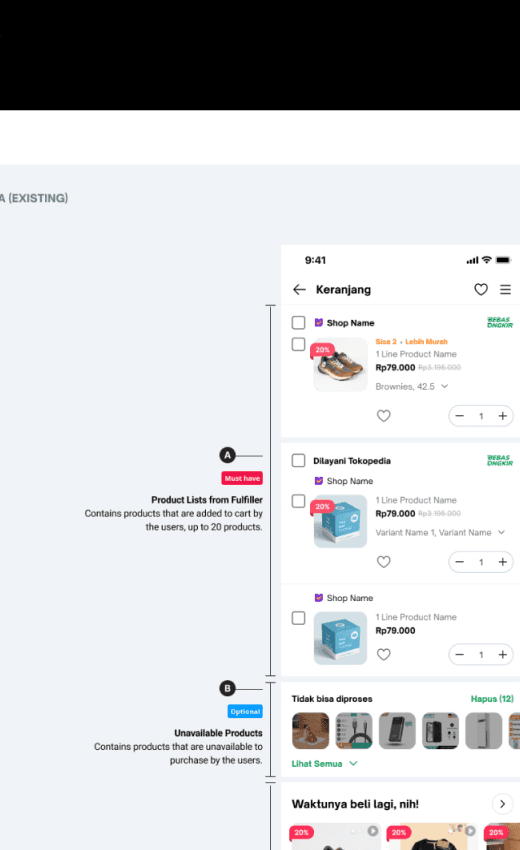
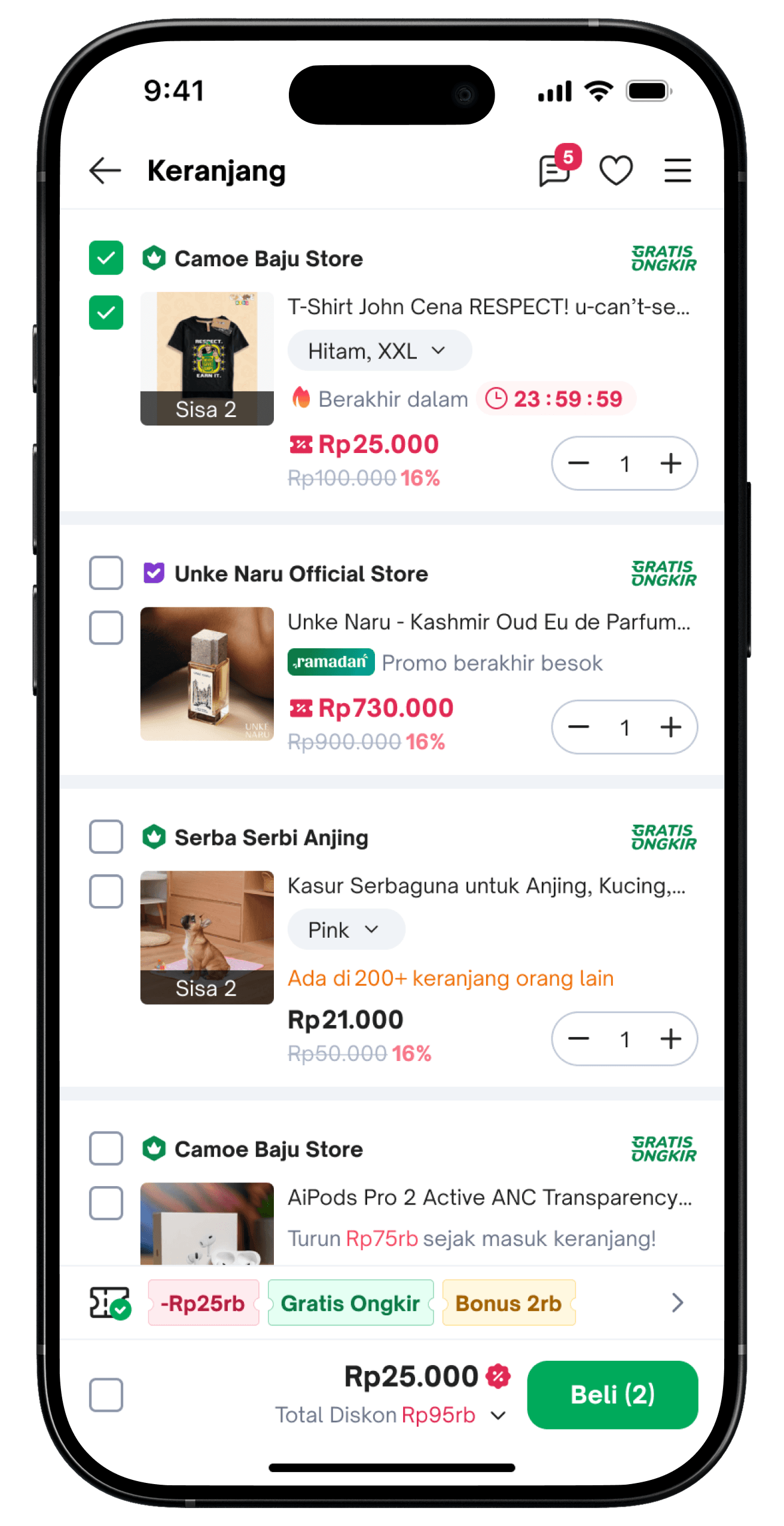
Cart after — density, promo bar, sticky CTA
We merged what mattered and cut vertical waste. Variant, wishlist, and campaign labels got smaller moves so the row showed image, name, price, variant, promo.
The sticky bar does two jobs: benefit amount over coupon count (pills + “Total Diskon” / “Hemat…”) and a checkout CTA that stays in reach. Buyers no longer scroll to the bottom to see savings or buy.
Urgency and social proof sit on the row: countdowns, “Sisa 2”, “Ada di 200+ keranjang orang lain”, price-drop callouts.
Checkout — itemized savings, then continuity
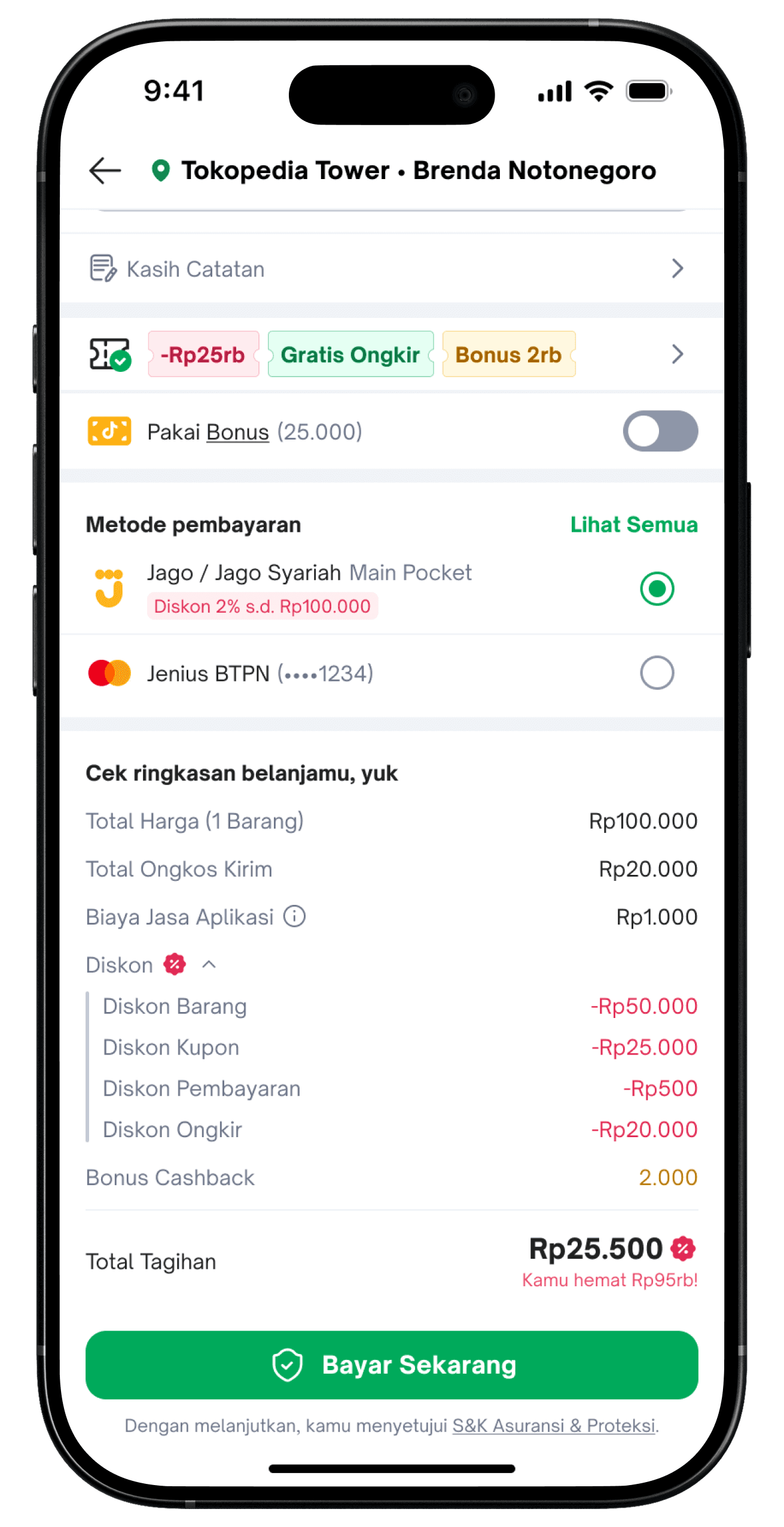
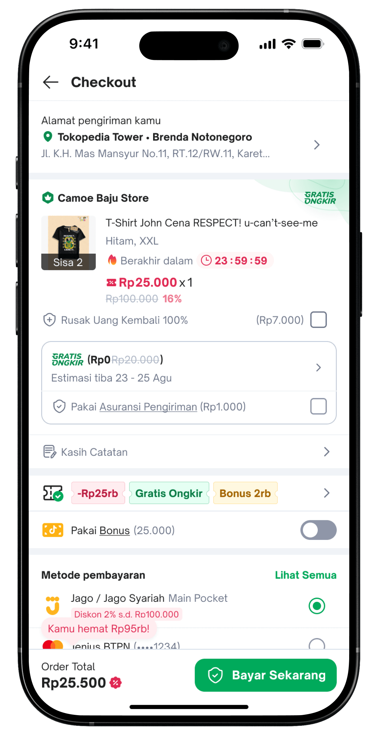
The order summary expands every benefit: product discount, coupon, payment discount, shipping — then a clear “Kamu hemat…” total. Buyers see affordability at commitment.
The same promo language continues into checkout: pills, payment incentives, free-shipping math. Savings stay visible after cart.
Validation
After locking cart and checkout, we ran usability tests and an A/B test into the Ramadan ’25 launch window.
Buyers kept returning to three points:
- Promotions showed up in the purchase flow itself — home and PDP weren’t the only places
- Visible discounts and social cues at the CTA made “buy now” easier to say yes to
- The layout read faster: less chrome, clearer hierarchy, less hunting
The lifts in the overview — purchase flow, AOV, orders per user, checkout — came from that launch. Exact experiment windows and baselines stay confidential. Qualitative and quantitative reads pointed the same way.
Final design
Shipped cart and checkout keep promo visibility continuous: denser rows, itemized price math, urgency and social proof next to the CTA, and a sticky path to pay.
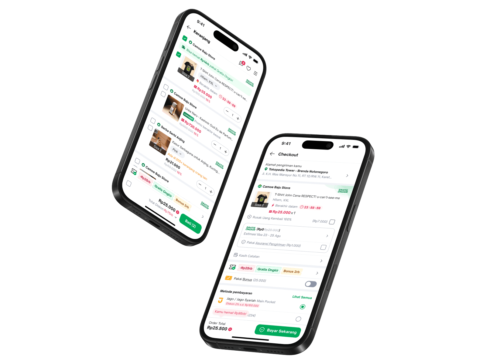
Other Tokopedia surfaces picked up the promo color treatment from this work. Research, writing, product, and design system lined up around one purchase narrative.
Takeaways
If savings vanish between PDP and cart, homepage campaign creative won’t fix the drop. Promo continuity is a product problem.
The moves that mattered most were benefit amount over coupon count, sticky savings plus CTA, and honest itemized math at pay. Buyers decide on price change and confidence.
Other surfaces could inherit the same promo visual language. Cart and checkout stopped being where the affordability story died.