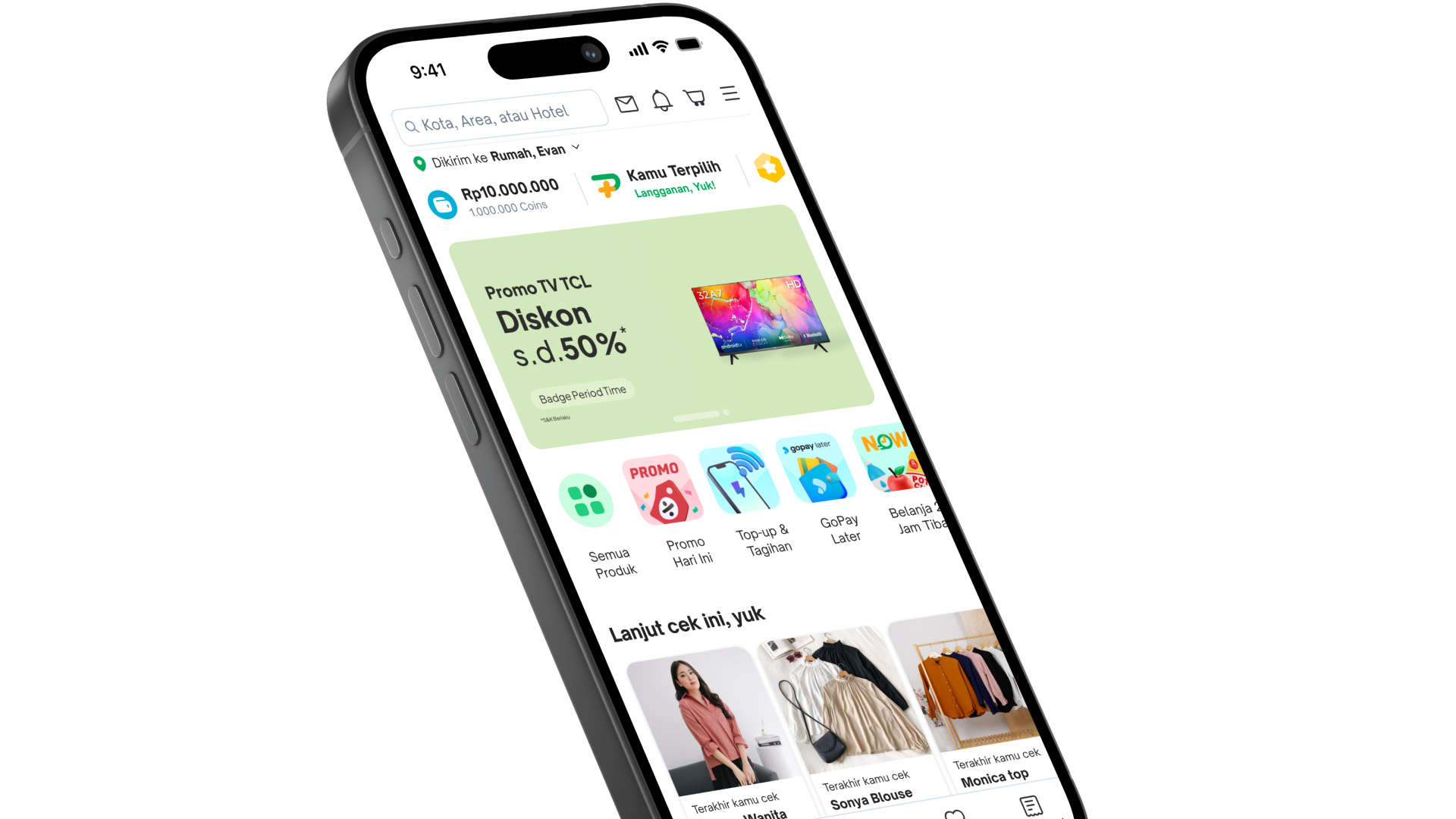

Tokopedia
Product Designer
2022 — 2023
Tokopedia: making user’s home uniquely theirs
Decluttering and personalizing Tokopedia Home so half of daily sessions find something worth buying
Overview
Half of Tokopedia’s daily sessions start on Home. When that surface feels cluttered, discovery stalls before the funnel even begins.
In 2022–2023 I worked on the homepage redesign with product design, research, writing, and PMs. Home had been seen as stronger than competitors for a couple of years. Users and stakeholders then started calling it overwhelming: long, repetitive, hard to tell sections apart.
We rebuilt above the fold and a set of below-the-fold widgets around personalization and a Bigger & Bolder visual direction. The goal was simple: Home should feel like yours, show content worth scrolling for, and still leave room for serendipity when intent is fuzzy.
The product
Home is the first stop on app and web. With about 50% of daily sessions originating there, browsability matters: people with different shopping maturity and needs have to find something relevant and go deeper into the funnel.
We also treated Home as a place for accidental discovery. Not every visit starts with a clear shopping intent. The page still had to reward that browse.
The problem
Qual and quant research on everyday use lined up.
Users said the homepage was thorough but too long. Below-the-fold sections often went unseen. Redundant blocks made it hard to tell one widget from another, so people stopped scrolling when the page started to feel like a loop. Recommendations they wanted sat too far down. On lower-capacity Android phones, the page felt heavy to load.
Three problem statements owned the brief:
- I can’t tell the difference between each section. Similar widgets stacked without clear hierarchy. Redundancy blocked further scroll.
- The content is not relevant to me. Product recommendations often matched browse history, but the overall page still felt generic.
- The homepage is too long. Length plus repetition meant people never reached the useful parts.
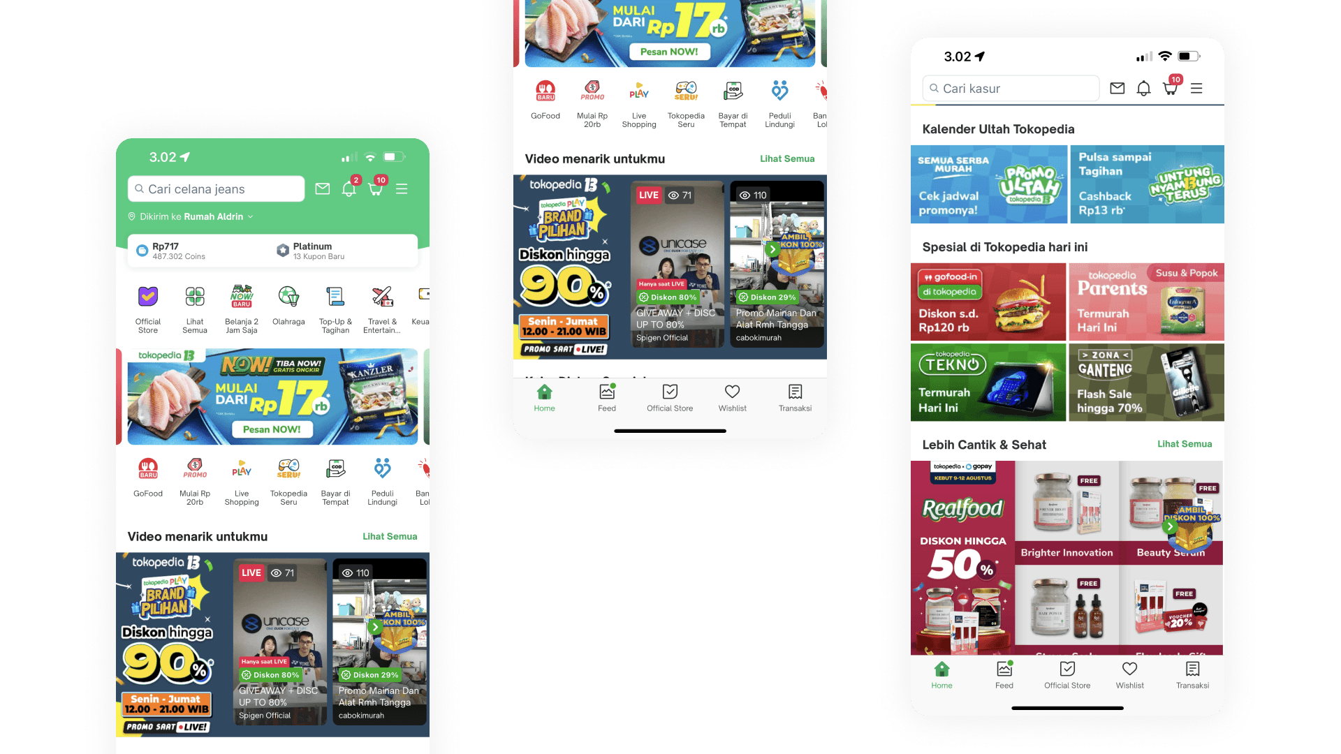
Three levers framed the work: personalization for relevance, UX improvements to widgets and page structure, and deals that actually felt personal.
Research
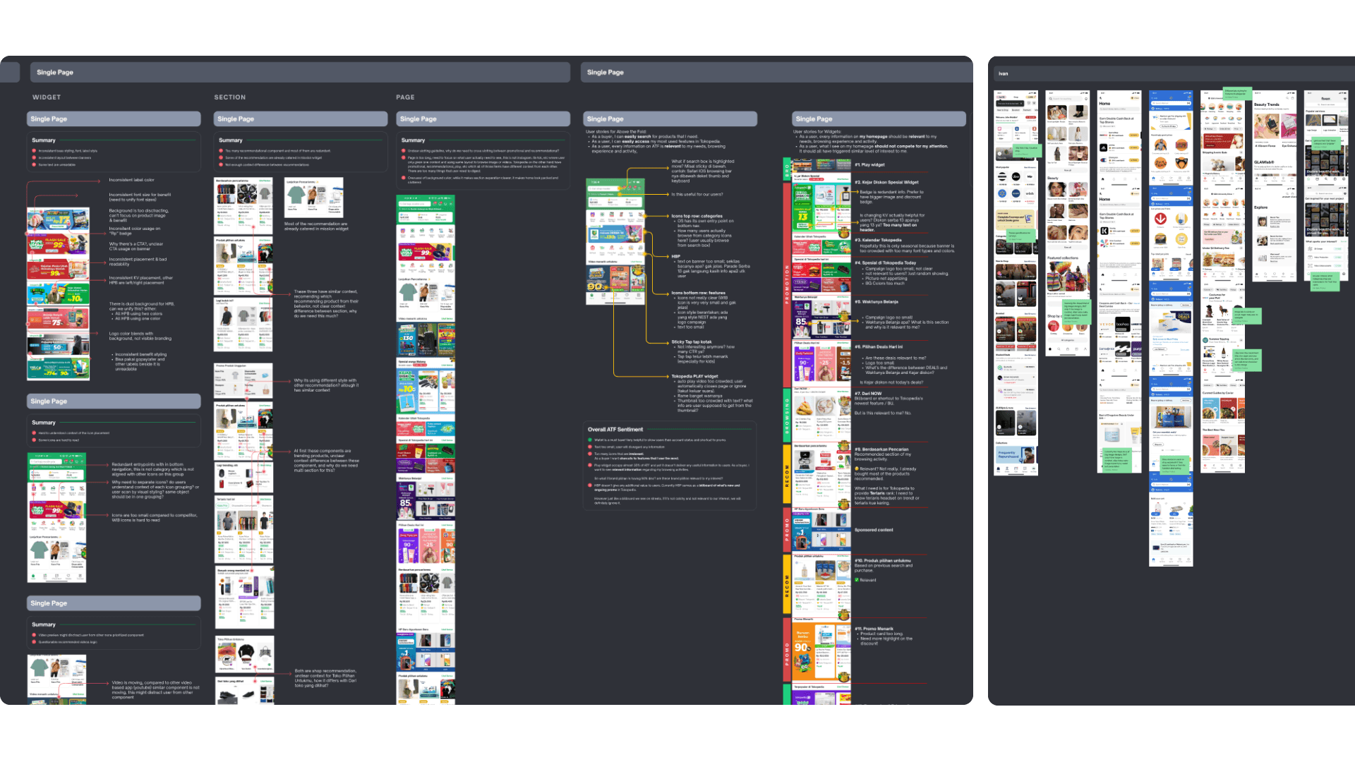
We combined user research with desk research: a design audit of every Home widget, plus competitive homepage comparison.
For each block we asked whether it earned its place. Did it deliver value users needed on Home, or was it noise? The audit and competitor boards made the redundancy and density problems concrete before we drew a new ATF.
Direction
Five principles kept the team aligned on what “new Home” meant:
- My home is uniquely mine
- All content in my home is valuable to me
- Everything meets my expectation
- Home will assist me in getting things done
- I find delightful surprises at Home
Visual direction landed on Bigger & Bolder. Hierarchy had to read at a glance: large primary surfaces, clear type, less chrome fighting for attention.
Design solutions
Above the fold
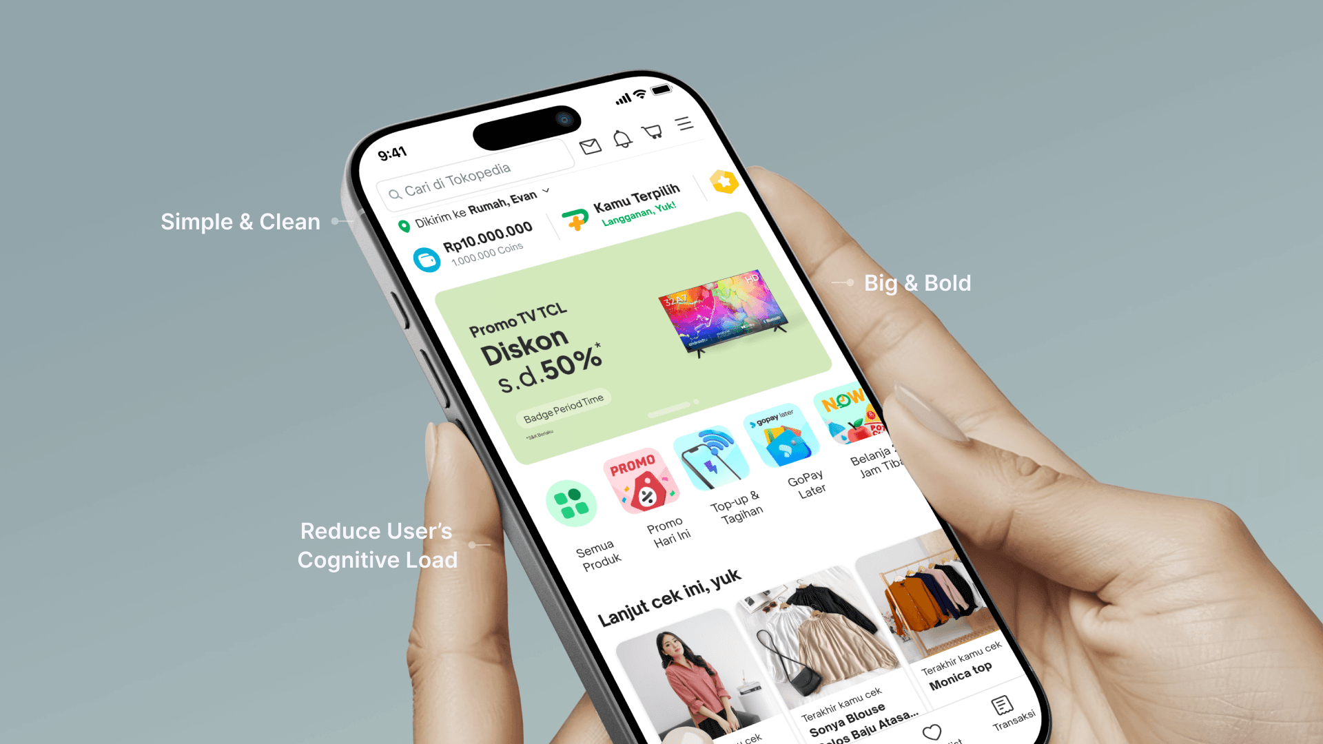
EXPLORATIONPrinciples and direction produced several ATF alternatives. We kept pressure on the core problems: section clarity, relevance, and length above the first scroll.
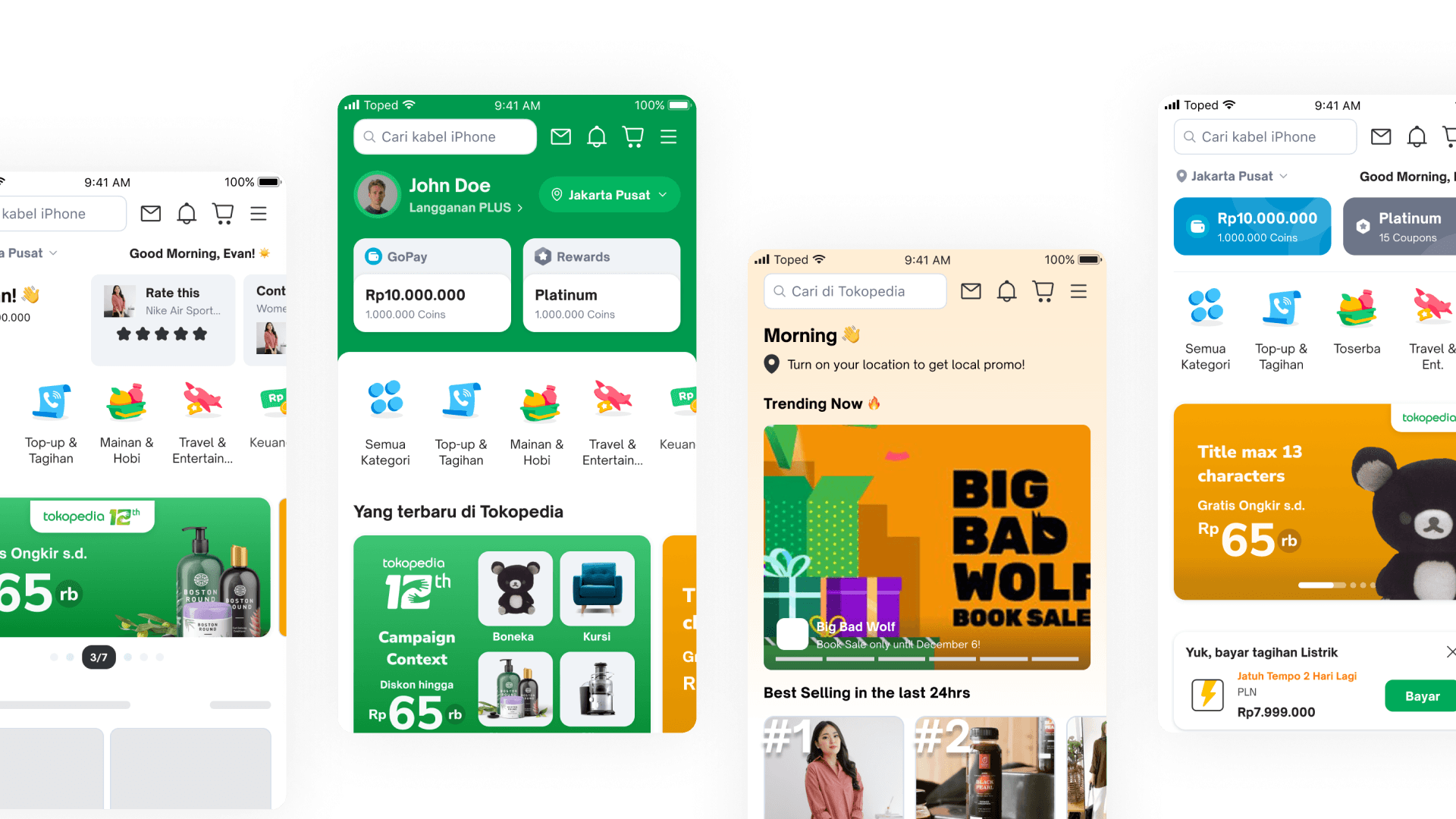
The shipped ATF leans on three moves: a simpler header and wallet strip, a large primary banner that carries the campaign, and a shorter set of entry points so cognitive load drops before the first product row.
Below the fold
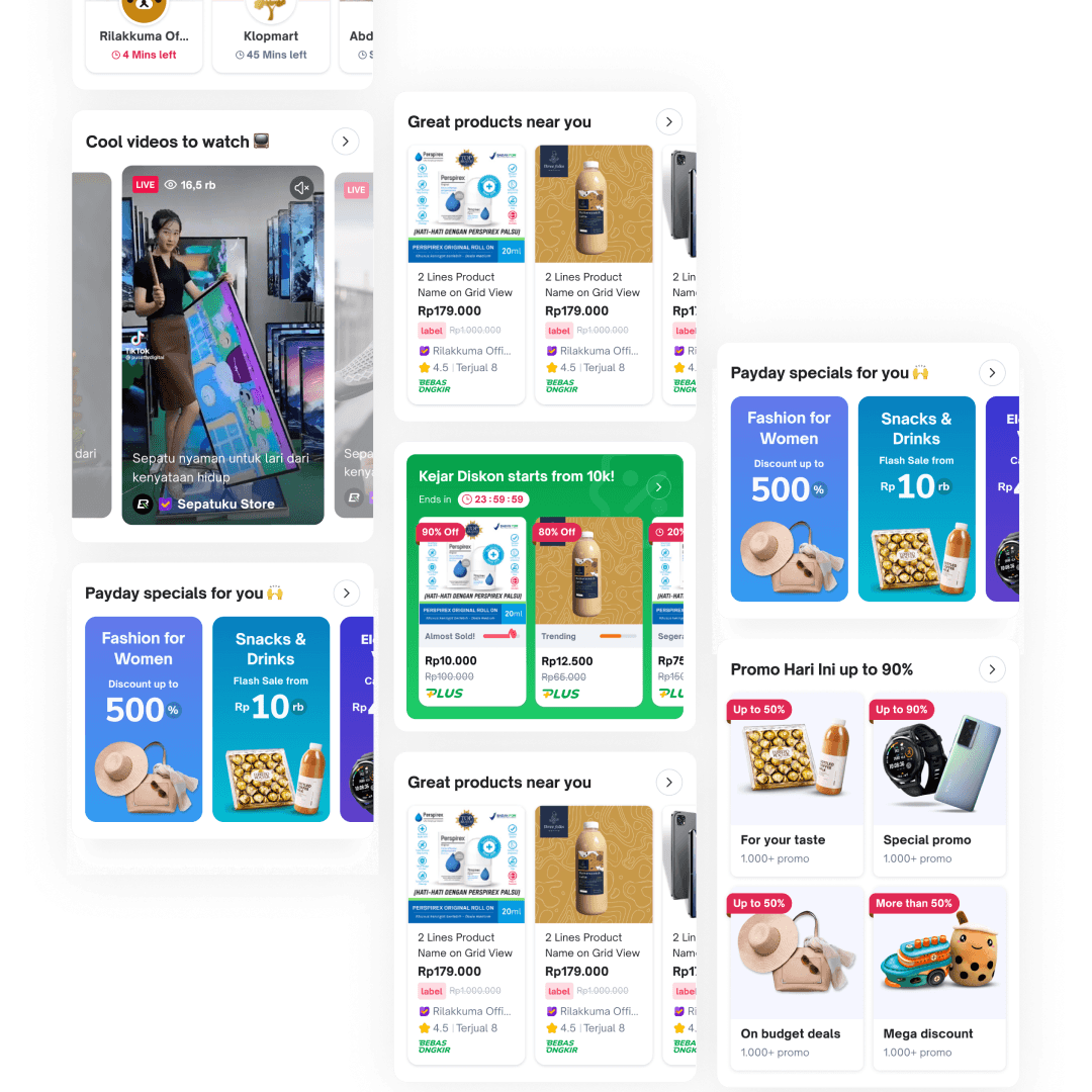
The same principles reshaped Home widgets so they feel more useful and a bit more delightful further down the page. At the time of this write-up, 4 of 9 redesigned widgets were live; the rest were still in development.
Impact
Above the fold moved with the redesign: CTR +0.65%, CVR +13.41%, homepage TIV +18.47%. Banner CTR rose +33.71% and banner CVR +18.78%. Tokopedia PLUS entry clicks rose +34.96%.
Below the fold, several new widgets showed CTR gains up to +35%, with better ads revenue and overall conversion alongside them.
Home sits at the center of company strategy. It has to stay adaptive to what users need and to where the business wants to go. This pass was one chapter, not the last.
Takeaways
If Home feels long and samey, users stop before personalized recommendations ever get a chance. Hierarchy and uniqueness beat packing more widgets.
Bigger & Bolder only worked because principles forced every block to justify itself. Cutting chrome and enlarging the primary story made relevance readable.
Half of sessions start here. Treating Home as a product made the lifts show up in CVR, banner, PLUS, and widget CTR.