
Kredivo
Product Designer
2025 — Present
Building Flex: Kredivo's Design System
How one designer turned a component graveyard into a scalable single source of truth
Overview
When I joined Kredivo, the design team already had a "Design System." In practice, it was a component graveyard. No hierarchy, no ownership, no rules. Same button in six variations. Colors hardcoded everywhere. My job: turn that mess into an actual system.
CASEKredivo's existing "design system" functioned as shared component storage, not a real system. No single source of truth, no structure, no rules. As the product ecosystem scaled, this created increasing design debt, slowed iteration, and made quality difficult to maintain, especially as the team grew.
- 55 components built and shipped as the Flex Core Library
- 84.5% Design System Health Score — rated "Highly trusted & efficient" (Q4 2025)
- 110,159 total component instances across Figma files — proof the system is actually being used
- 94.22% overall system stability (detach rate: only 5.78%)
- Faster design iteration and reduced time-to-market
- New designer onboarding enabled through shared system and documentation
Design System Audit
Before building anything, I needed to understand what we actually had.
I conducted a comprehensive audit of the existing Figma file — reviewing every component, mapping duplicates, tracing inconsistencies back to their source. The findings weren't subtle.
① No single source of truth. The file worked as shared storage, not a canonical reference. Components were created and modified independently, with no clear owner and no canonical version. When something changed, it changed in one place — and nowhere else.
② No structure, no rules. Without explicit guidance, design decisions relied on individual judgment. That works fine when a team is small and moves fast together. It breaks down when the team grows, when new people join, or when two designers work on the same product without syncing. The result: inconsistency that compounds over time.
After the audit, one thing was clear: incremental cleanup wouldn't fix this. The file needed to be rebuilt with intention — not patched.
Defining the System Concept
With the audit complete, I introduced a system-first approach grounded in Atomic Design principles.
The core idea was separation of concerns — defining clearly what each layer of the system was responsible for:
- Core Components — the atomic building blocks. Buttons, inputs, tags, icons. Things that appear everywhere and must be absolutely consistent.
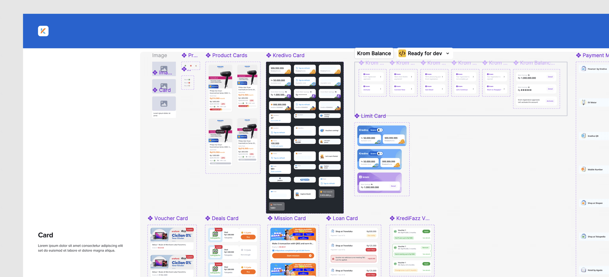
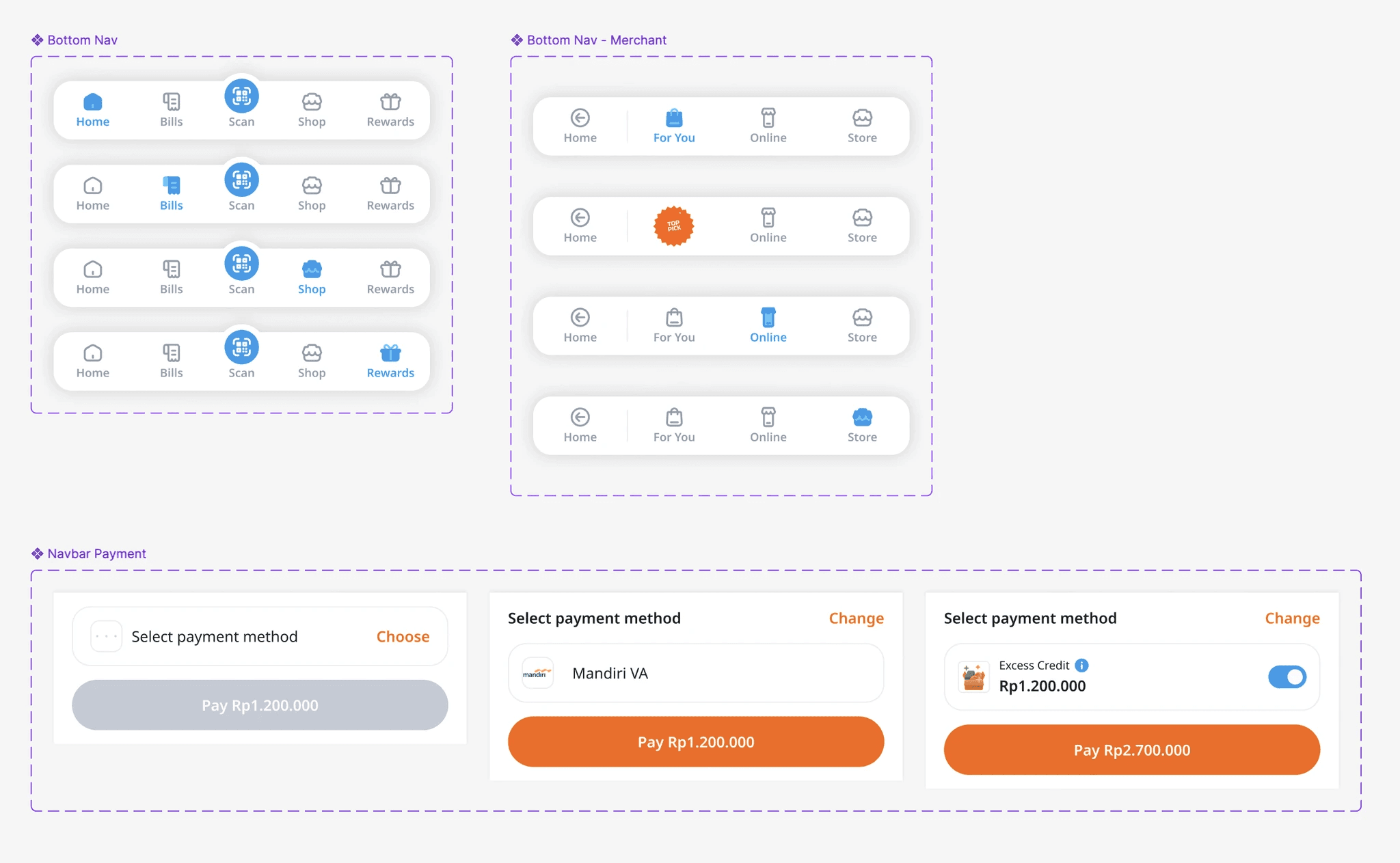
- Composite Components — combinations of core components assembled for recurring patterns. Cards, modals, navigation bars.
- Product-specific implementations — where teams apply the system to their specific context. The system defines the rules; the product applies them.
This separation was the foundation of everything that came after. Without it, the system would eventually collapse back into what it was: a big pile of components with no real hierarchy.
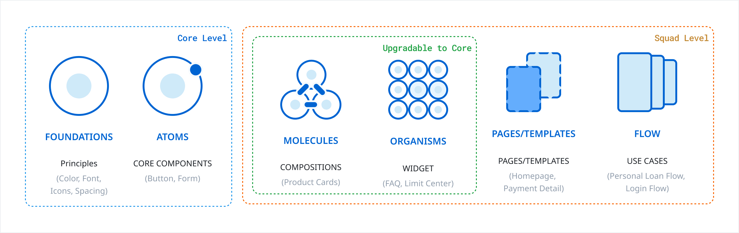
Kredivo's product ecosystem was growing — multiple teams, multiple surfaces, increasing complexity. Atomic Design gave us a mental model that non-designers (engineers, PMs) could also understand and apply. The vocabulary — atoms, molecules, organisms — mapped cleanly to how engineering thought about component architecture. That shared language was worth as much as the system itself.
The name wasn't accidental. "Flex" reflected the system's core design principle: modular and adaptable, not rigid and prescriptive. The system needed to flex with the product — not constrain it.
Component Classification & Prioritization
One of the most important decisions in building a design system is deciding what not to build first.
Rather than attempting to systematize everything at once, I mapped every component against three criteria:
- Frequency — how often does this appear across products?
- Consistency impact — how much visual debt does inconsistency here create?
- Risk — what breaks if this stays unstandardized?
This produced a priority matrix with four tiers: Tier A (≥70% impact), Tier B (40–69%), Tier C (20–39%), and Tier D (under 20%).
THE RESULT9 Tier A components that formed the backbone of Flex and received the most rigorous treatment — Button, Checkbox, Shimmer, Navigation Bar, Divider, Section Title, Chips, Pagination, and Background Overlay. These 9 components alone account for the majority of all real design work happening across Kredivo's products.
The output wasn't just a build order. It was a commitment: build a lean, high-impact system first — and resist the temptation to boil the ocean. A smaller system that teams actually use beats a comprehensive system that sits untouched.
Component Construction
Each core component was built to the same standard — not because of process for its own sake, but because consistency in how components are built is what makes a system trustworthy.
EVERY COMPONENT INCLUDEDClearly defined anatomy. Each component was broken down into explicit structural parts. Not just "here's a button" but "here's the container, the label, the icon slot, the state layer" — and what each part is responsible for.
Explicit interaction states and behaviors. Default, hover, pressed, disabled, loading, error — all defined and documented. Inconsistency in states is one of the most common sources of engineering rework.
Scalable variant structures. Variants were organized systematically — by size, by emphasis, by state — so adding new variants in the future didn't require restructuring the component.
Usage rules and constraints. Clear guidelines for when and how each component should be used — and equally important, when it shouldn't.
Ongoing Improvement #1: The Measurement System
I built a Design System Health Score framework — a usage-weighted metric that reflects how impactful and reliable Flex is in real design work. The formula is simple but meaningful: components that are used more often contribute more to the score; rarely-used components have minimal influence; high usage with low reliability pulls the score down.
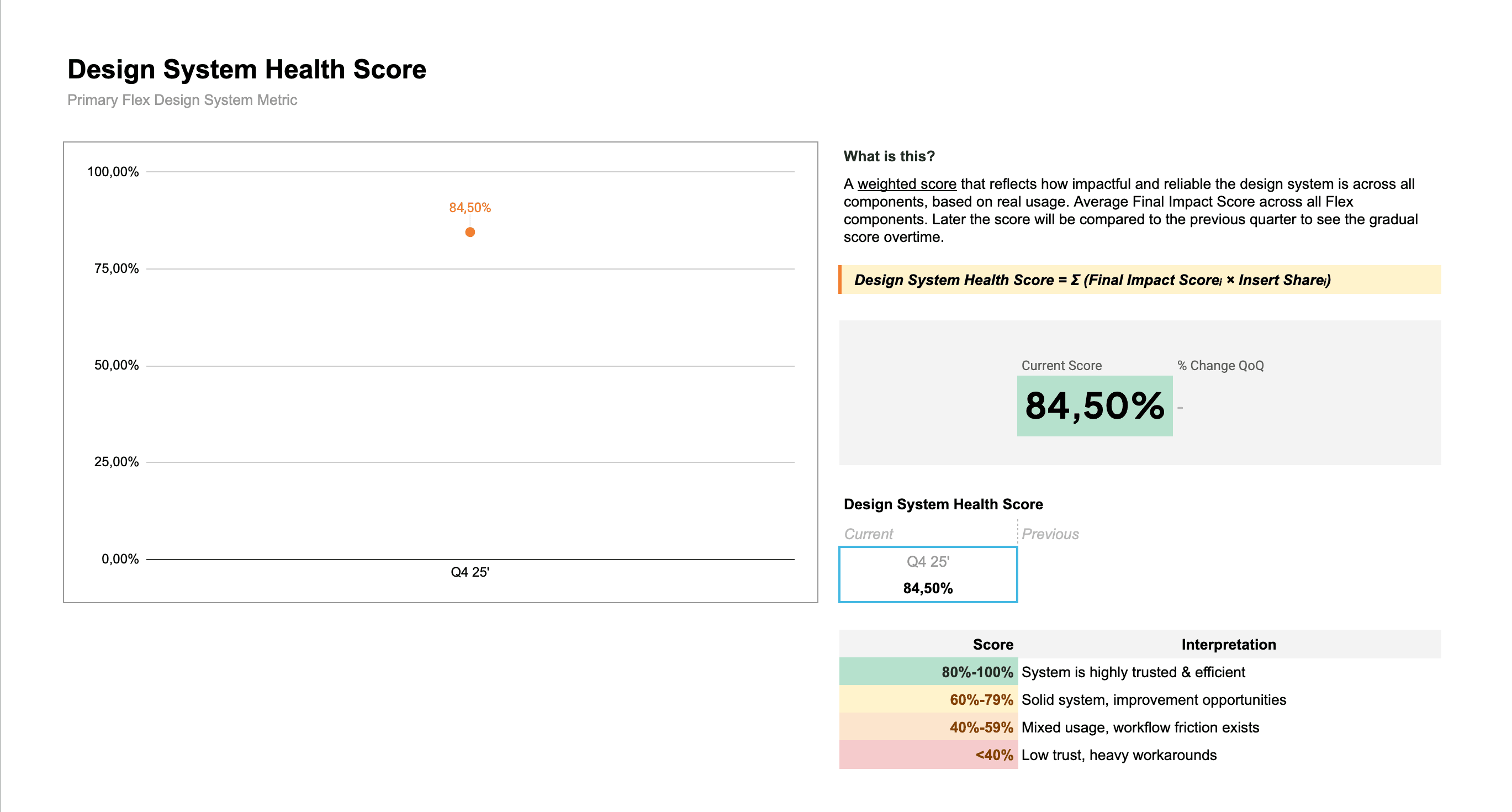
As of Q4 25'–Q1 26', Flex scores 84.5% — placing it firmly in the "Highly trusted & efficient" tier (80–100%).
WHAT'S BEHIND THE NUMBER- 110,159 total component instances across all Figma files
- 94.22% system stability — designers are using components as-is, not detaching and overriding
- 9 fully Tier A components consistently driving the majority of insertions
- Button alone: 50,306 instances, 99.19% stability
This measurement system now runs quarterly, giving us a data foundation to prioritize improvements rather than guessing at them.
Ongoing Improvement #2: Lean Token System
Separately, I took a hard look at something I'd built myself.
The color token system had grown to over 140 tokens. Many were unused. Several overlapped. The system that was supposed to reduce maintenance cost was becoming a source of it.
This is the part of design system work that doesn't get talked about enough: a design system is never finished, and the hardest feedback to act on is feedback about your own decisions.
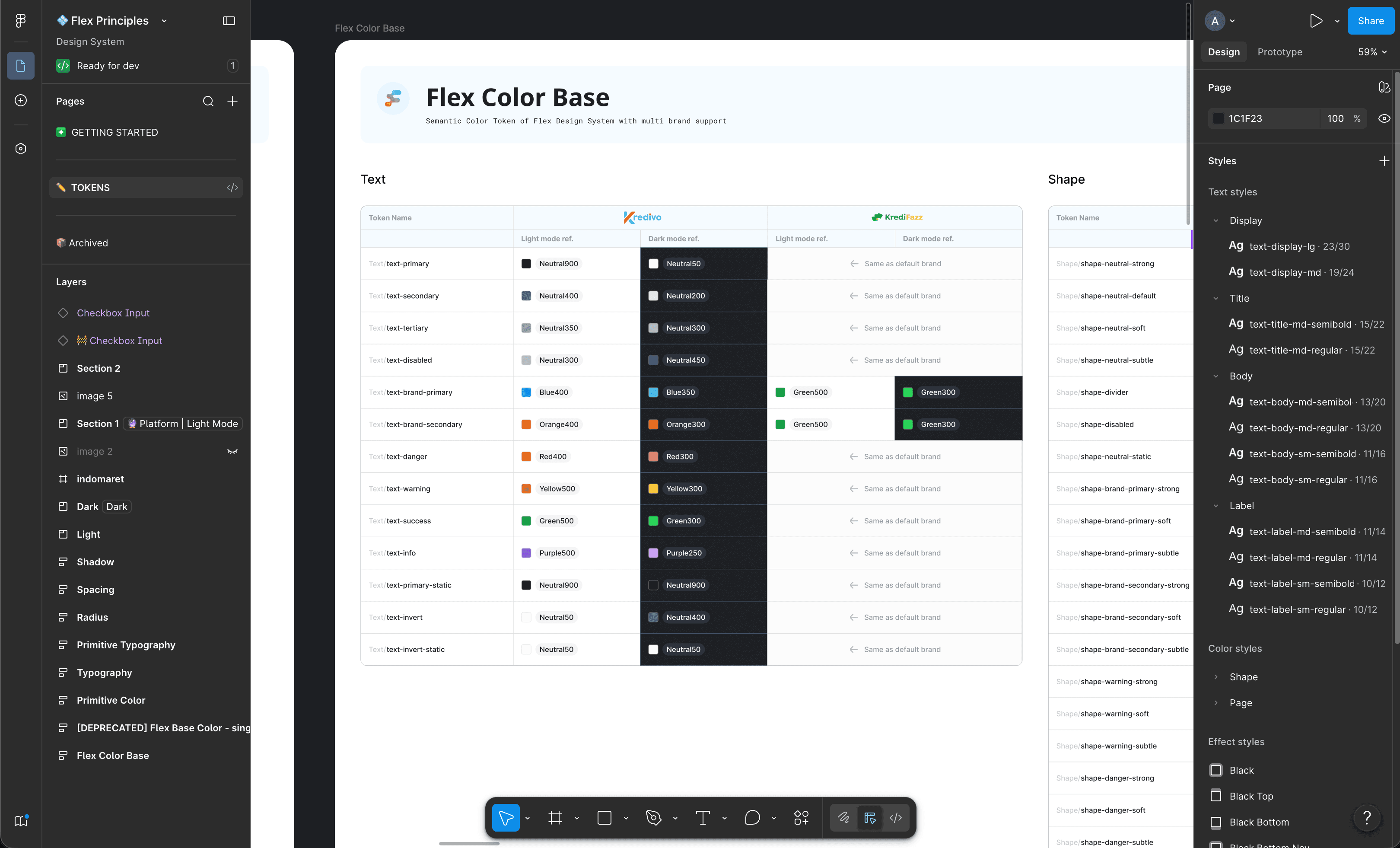
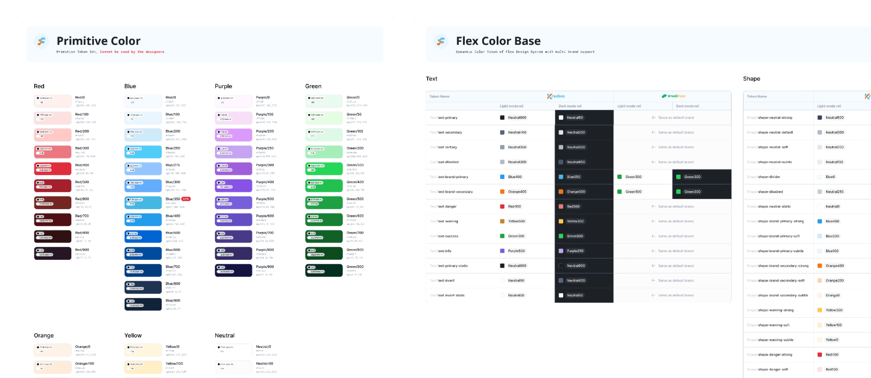
Rather than patching individual tokens, I restructured the system around semantic meaning, and make it leaner. Use shape-brand-primary for background, border, and supergraphic, instead of dedicated tokens for each semantic need.
This shift from descriptive to semantic means:
- Fewer tokens — by eliminating duplicates and near-duplicates that served the same semantic purpose
- Stronger consistency — because semantic names make the right choice obvious and the wrong choice visible
- Easier long-term maintenance — when the brand color changes, you update one token, not forty
Impact & Outcomes
① For the business: Faster design iteration and reduced time-to-market. Lower rework costs through standardized components. Reduced long-term maintenance overhead. Improved product consistency — which, at Kredivo's scale, directly strengthens brand trust.
② For the team: New designers can onboard and start contributing faster. There's a shared design language across teams — fewer alignment meetings, clearer handoffs, less time spent on decisions the system has already made.
By the numbers (Q4 2025):
- 84.5% Health Score — "Highly trusted & efficient"
- 55 components shipped
- 110,159 instances in active use
- 94.22% stability across the entire library
- Tier A: 9 components | Tier B: 5 | Tier C: 6 | Tier D: 35
The hardest part isn't building — it's deciding what not to build. The priority matrix wasn't strategic theater. It was about focusing limited time on components that created the most value for the most people.
KEY TAKEAWAYSA design system is a product, not a file. It needs ownership, maintenance, and a way to measure its own success. Building the Health Score framework forced me to define what "working" actually means — and that clarity shaped every prioritization decision that followed.
Measuring your own system changes how you build it. When you know that high detach rate lowers the Health Score, you stop treating detach as a neutral signal. You investigate why people are detaching — and fix the actual problem.
The moment the system worked wasn't when the Figma file looked clean. It was when a designer joined the team, opened Flex, and knew exactly where to find what they needed — without asking anyone.