
ASTRO
Freelance UI/UX Designer
May — Jul 2021
ASTRO: groceries in minutes
Designing ASTRO’s early grocery app so shoppers could trust both the freshness and the speed
Overview
In mid-2021, buying groceries online in Indonesia still felt like a dare. People worried the greens would arrive soft and the rider would arrive late. ASTRO bet the other way: keep stock close to customers, deliver in minutes, and make that promise visible in the app, not just in the ads.
I joined as a freelance UI/UX designer for about three months, from May to July, working alongside one other designer. The lead product designer set the direction and principles. I owned the buyer grocery flow from start to finish, the design system that grew out of it, and the referral feature. We shipped the full buyer experience to the App Store and Google Play with almost no formal research: ship, watch, learn.
The problem
ASTRO was part of the early quick-commerce wave, starting from warehouses around Jakarta, and competitors like Halofresh were already in the market. Our brief was blunt: help people get the freshest groceries with very fast delivery.
We designed for two groups: housewives restocking the kitchen, and office workers grabbing staples between meetings. Both already knew how a warung (a neighborhood shop) works, so the app had to feel that familiar, only faster.
Trust broke in two places. The first was speed. A banner that shouts “15 minutes” means little if checkout goes quiet about when the bag will arrive. The promise had to sit next to the address, on Home when you start and in the cart when you pay.
The second was freshness. People want to know how long food will last, and they want to add staples without opening a product page for every item. Most e-commerce apps send you through the product page before the cart, but weekly milk and noodles shouldn’t need that extra step.
Growth ran on the same timeline. A grocery app built only for browsing stalls if inviting friends is buried, so referral needed a reward you could say out loud and a share screen people would open on purpose.
The approach
The lead’s two principles were bold and straightforward. If a screen needed a paragraph to explain itself, it was wrong.
We treated the whole buyer journey as one argument: you’ll get good food, soon, from here. Home, the product page, the cart, and referral each carry part of it.
The design system came out of that work. A little over ten components (cards, badges, location chips, promo surfaces) emerged from patterns we kept repeating, and they kept those four screens consistent while we moved at launch speed.
The design
HOME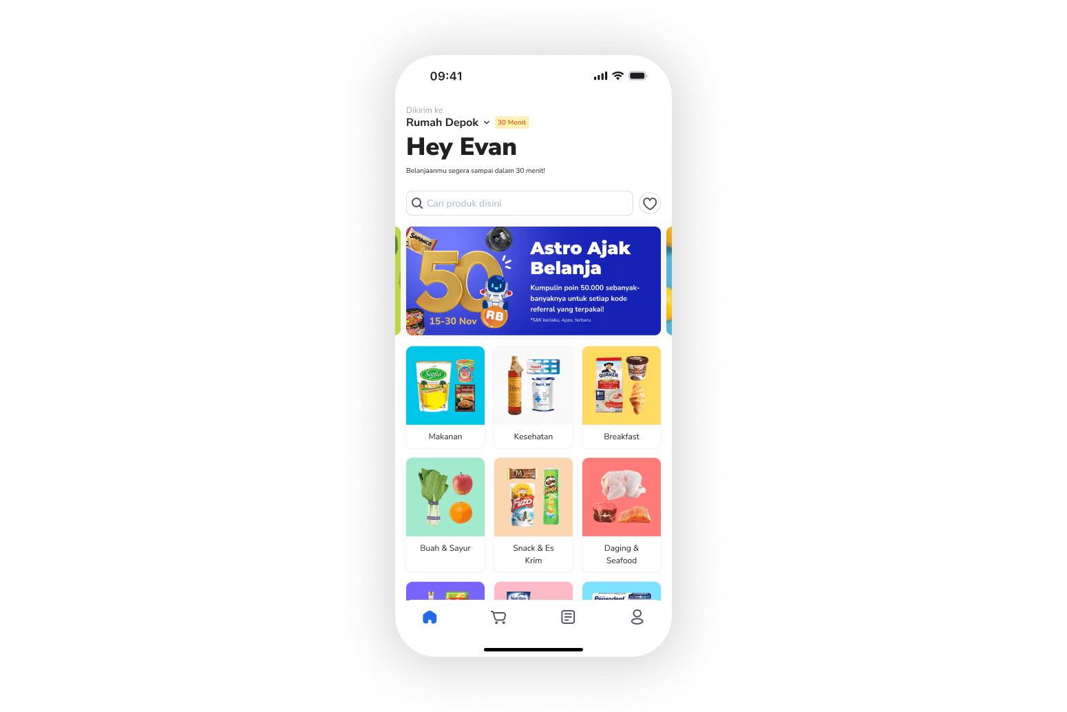
Home opens with where your order is going and how long it will take. The greeting repeats that promise in plain words, and categories use large product cutouts so you can scan the aisles at a glance. When a campaign is running, it sits in the same first scroll (referral, in this frame), so shopping and growth share one screen.
PRODUCT DETAIL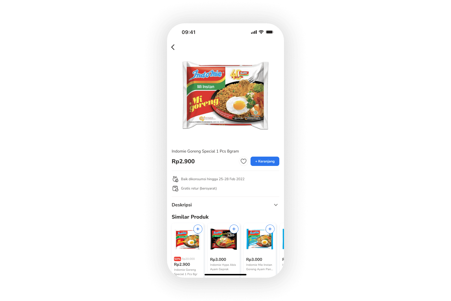
The product page is for judging an item, not a gate you pass through on every add. Price and the add button sit together. The best-before date (“Baik dikonsumsi hingga…”) and the return terms appear as plain facts under the product. Similar items each have a blue +, so one visit can fill the basket without going back to Home.
CART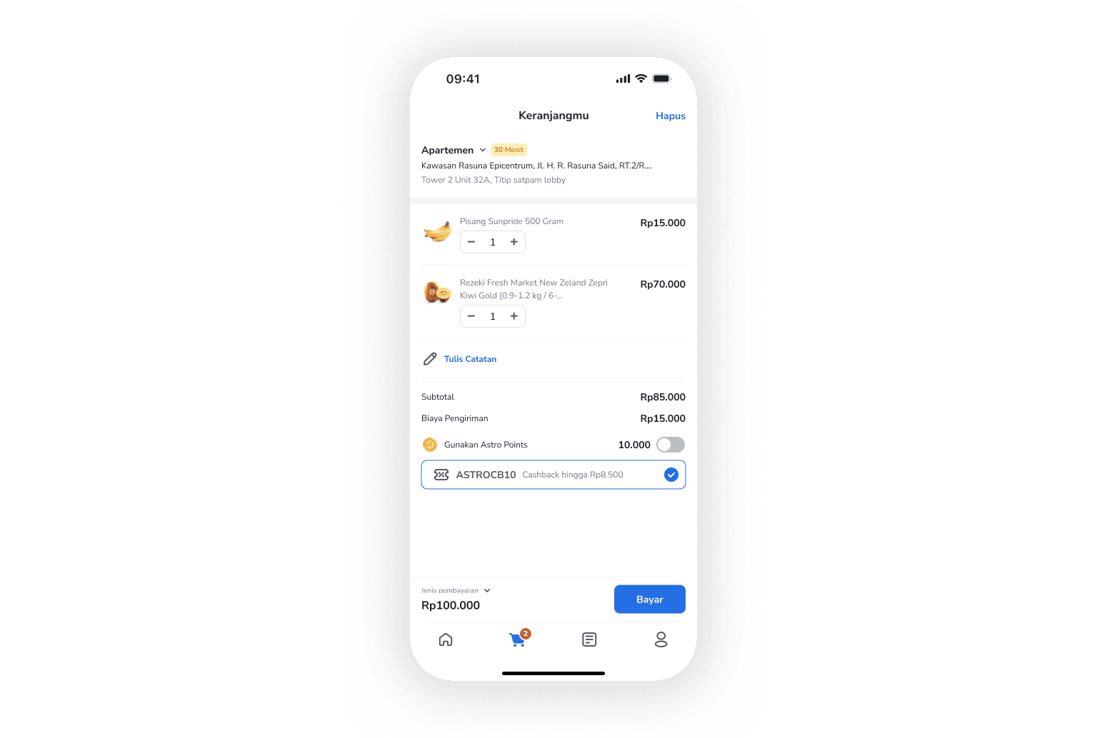
The cart confirms the order. Destination and delivery time stay on the address row, and items, notes, shipping, points, and promos all lead to a single Bayar (Pay) button. If speed only lived in the marketing, this is where trust would break, so we kept it visible on purpose.
REFERRAL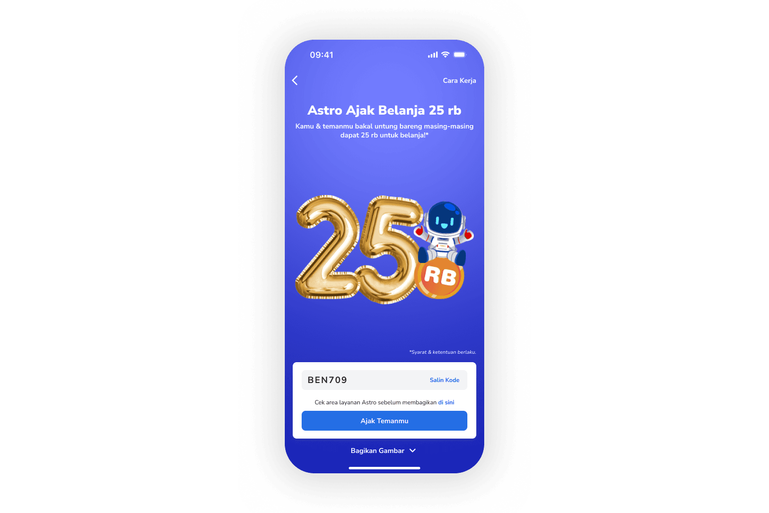
Referral leads with the reward. Below it are the code to copy, a check for whether a friend is in the service area, and buttons to invite or share an image. People share when the reward is obvious. The mascot and colors help people recognize the screen, but they don’t replace a clear number.
Outcome
We launched the full buyer experience within the three months. I’m not putting soft numbers in a metric grid here, because I don’t have figures I’m comfortable publishing. What shipped was the argument itself: speed next to the address, freshness on the product page, a cart that still tells the truth, and referral that leads with the reward.
I don’t remember a major redesign of these screens right after launch. The next lessons came from live orders rather than another round of guessing.
Takeaways
Delivery promises belong next to the address on every screen where money or commitment comes up. A hero banner can’t carry trust all the way to checkout.
Grocery apps should let people add items the way they would in a store. The product page still matters for expiry dates and returns, but it shouldn’t be the only way into the cart.
Referral is a product feature, not a footer link. Lead with the reward, keep the code one tap away, and make sharing the main job of the screen.